Picking a sticker size sounds trivial until the proof arrives and the logo that looked crisp on screen is either lost on the corner of a laptop lid or swallowing an entire water bottle. Size is the single decision that most often separates a sticker that gets used from one that sits in a drawer. It controls legibility, where the sticker can physically go, and how much you pay per piece. This guide walks through the sizes that work for the most common uses, why they work, and how to pick when your artwork does not fit neatly into a standard box.
The sizes below are indicative industry norms rather than fixed rules. Every design behaves a little differently: a wordmark with fine text needs more room than a bold icon, and a busy illustration shrinks worse than a simple silhouette. Treat the numbers as a starting point and always check them against your own artwork at full scale before you order.
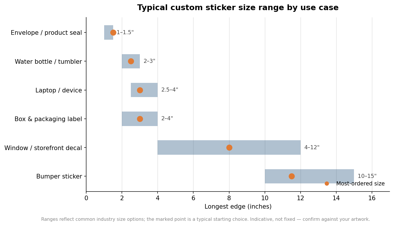
Small seals and labels: 1 to 1.5 inches
Round seals for envelopes, tissue paper, mailer boxes, and jar lids live in the 1 to 1.5 inch range. At this size a sticker reads as a finishing touch rather than a focal point, which is exactly what you want on packaging that already carries other branding. The design has to be simple to survive the reduction. A single icon, a monogram, or a short tagline works; a full logo lockup with a strapline and a website URL will turn to mush. As a practical test, if you cannot read the smallest element on your artwork at arm’s length when it is printed at 1.25 inches, cut that element before you shrink further. Circles and squares both work here, and a 1.5 inch circle is one of the most forgiving, widely stocked options in the category.
Water bottles, tumblers, and laptops: 2 to 4 inches
This is the heart of the custom sticker market, and it is where most brand and merch stickers land. For a water bottle or an insulated tumbler, 2 to 3 inches sits comfortably on the curved surface without wrapping so far that the edges lift. A 2.5 inch sticker is a safe default. Curvature matters more than people expect: the tighter the bottle, the smaller the sticker needs to be to bond flat, so a slim 20 ounce tumbler wants something closer to 2 inches while a wide growler can take 3.
Laptops and tablets give you more room, and 2.5 to 4 inches is the usual span, with 3 inches the most-ordered size for a single logo. If you are designing a set meant to be mixed and matched across a lid, plan around a 3 inch flagship piece with a few 1.5 to 2 inch accents rather than several large stickers that compete. Die-cut shapes read larger than their nominal size because the whole silhouette is the design, so a 3 inch die-cut often has more presence than a 3 inch sticker floating on a square.
Product and packaging labels: 2 to 4 inches, shape-led
Packaging is where size and shape stop being interchangeable. A label has to fit a defined panel, so you are usually working backward from the container. Measure the flat printable area of the box, pouch, or bottle and leave a margin of at least an eighth of an inch on every side so slight misalignment during application does not run the design off the edge. Rectangular labels in the 2 by 3 to 3 by 4 range cover most retail cartons and stand-up pouches. The chart below shows how much the typical shape shifts between uses: a packaging label often runs wider than it is tall, while seals and laptop stickers stay square.
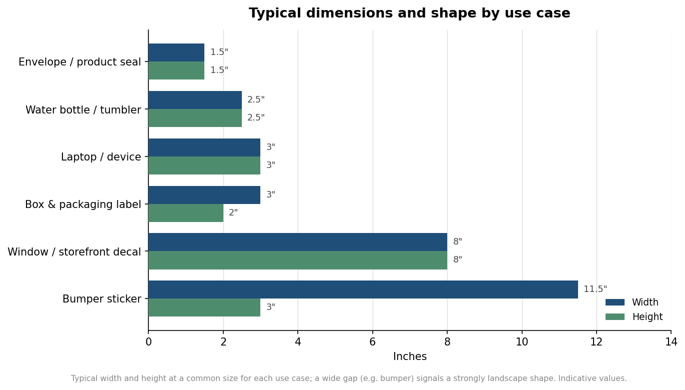
If you are labeling a curved bottle, keep the label height modest relative to the bottle diameter. A label that is too tall for the curve will tunnel or wrinkle at the top and bottom edges. When in doubt, a shorter, wider label conforms better than a tall, narrow one on round containers.
Windows, storefronts, and bumpers: go big and think distance
Once a sticker has to be read from across a room or a parking lot, the design rule flips: legibility at distance beats detail. Window and storefront decals commonly run 4 to 12 inches, sized to the message rather than the glass. A rough working guide used across signage is that lettering needs roughly one inch of cap height for every 10 feet of comfortable reading distance, so a decal meant to be read from 30 feet away wants text around 3 inches tall, which quickly pushes the overall decal past 8 inches. That relationship is approximate and depends on contrast and font weight, but it is a useful sanity check before you commit.
Bumper stickers have their own long-standing convention. The classic rectangular bumper sticker is about 11.5 inches wide by 3 inches tall, a shape that fits a car bumper and forces a short, high-contrast message. That extreme landscape ratio, visible in the second chart, is why bumper artwork almost never survives being reused at any other size without a redraw. If your message needs two lines or a detailed graphic, step up to a 4 by 15 inch panel rather than cramming it into the standard bar.
How to choose when your design does not fit a standard size
When your artwork falls between the common options, let the limiting factor decide. Start with the surface: measure where the sticker actually has to sit and treat that as your maximum. Then check the smallest critical element of the design, whether that is body text, a thin outline, or a registered trademark symbol, and make sure it stays legible at the size the surface allows. If the surface says small but the detail says large, the honest fix is to simplify the artwork, not to print detail that will not read. Finally, factor in quantity, because unit cost falls as you order more and rises with size, so a slightly smaller sticker at a higher count often delivers more usable pieces for the same spend.
Ordering a single physical proof, or printing your artwork at full scale on plain paper and taping it to the real surface, catches almost every sizing mistake before it becomes a box of stickers you cannot use. It costs a day and saves a reprint. Get the size right and the rest of the sticker decisions, from material to finish, get much easier.
Leave a Reply